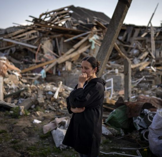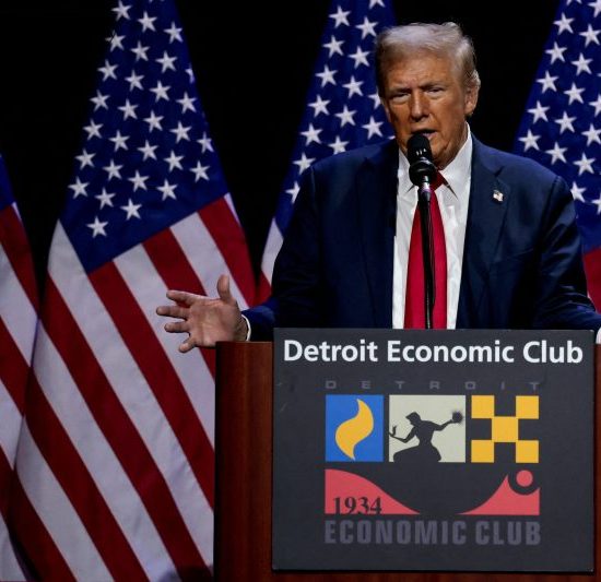
New polling conducted by a bipartisan set of firms on behalf of Fox News offers seemingly incongruous results. In the new poll, released Wednesday, former president Donald Trump leads Vice President Kamala Harris by two percentage points nationally. But in a collection of six swing states, Harris has the lead, by six points.
The story here isn’t really that the country is on the brink of a Reverse 2016, with Harris earning the presidency by eking out an electoral college victory while losing the popular vote. It is, instead, that the Fox News poll offers a similar message at both the state and national level: The race is close.
You can see how this works if we look at the national polling over time. Fox has conducted a number of polls over the past year evaluating support in the presidential contest. For much of that period, Trump was expected to face off against President Joe Biden and, until a July poll, enjoyed a sizable lead. But in July — and then in subsequent polling after Harris became the Democratic Party’s candidate — the race has bounced around. Trump had a narrow lead, then Harris and now Trump again.
That bouncing could be a reflection of a small group of Americans changing their minds — leaning toward Trump and then toward Harris and then back. Trends tend to be more revelatory than individual polls anyway, so the movement toward and then away from Harris might be important.
Polling averages, though, suggest something different: The bouncing is not because of changes of opinion. Instead, it’s probably just statistical noise. Averages of multiple polls, like the one compiled by The Washington Post, have smaller margins of error in part by virtue of including more data. Those averages also tend to show a relatively stable race.
If we show the national results from the Fox News polling with the margins of error that apply, the picture changes. The overlapping areas of light red and blue look less like bouncing and more like two overlapping ribbons.
In fact, let’s just take the lines representing the final results entirely. If you remember that the support seen by Harris and Trump could sit at about any point within those blue and red stripes (respectively), you realize that the state of the race for the past three months has probably mostly been one of stasis.
Polls are not about taking the precise temperature outside. Instead, they’re more about giving a sense of whether you’ll need a jacket.
This uncertainty — which, by acknowledging imprecision, is a feature of polling rather than a flaw! — applies to the state-level polling, too. Harris is up six points — but the margin of error for a margin is twice that of an individual value. (If a poll with a three-point margin of error has candidates at 51 percent and 49 percent, that might theoretically mean that, instead of a two-point margin, the difference is eight points: 54 percent to 46 percent.) Fox News’s write-up mentions that both the national and state results are within the margins of error — meaning that neither candidate has an unassailable lead and, therefore, that either candidate might end up winning.
(Never mind, of course, that a margin across swing states is less important than the margin in each swing state. The Post polling average shows Harris leading four of the seven swing states we’re tracking, but with each of those results landing within the range of uncertainty.)
Last month, we offered a map of the political landscape that we were confident would retain its accuracy through Election Day. Instead of showing which candidate was leading in swing states, it simply presents each of them as uncertain.
The map remains accurate.